
The Harmonious Barbershop Quartet
Next the barbershop design shows line, form, shape, space, repetition, symmetry, balance, as well as variety, movement, and pattern. I added some variety to this design with the main words by using different fonts. One in bold and the other in cursive, helps the entire piece stand out on what type of shop it is. I rounded the square around the artwork with the four male bodies to create a softer design. I chose to make the men all have the same clipper cut, tuxedo, mustache, hair, and bow tie to show how they all are harmonious and work to complement each other.

The Red Baby poster
is next as it shows a DJ with fire and bold letter design showcasing the main character’s features. This design does a great job showing creativity, unity, movement, texture, shape, 3D color, typography, as well as emphasis, form, line, and value. This red and black flier text design is intended to text close together in order for the picture of the woman’s body to be in the text. Though the text may be hard for some people to read, I made sure to have the text above it in a different spot so it is still legible. The DJ name at the top is supposed to be a relief, something that is calm and is not too busy for someone to read what the text below says. Then the 3d typographic design with the character’s likeness in the middle to be the main focus of the entire piece.
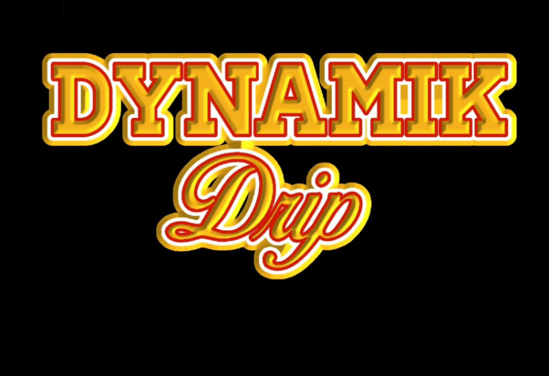
Dynamic Drip
For the third design- the text based design. I chose to add my text design to show how versatile I am as a designer. Not only can I create logo designs and character art, I also made this text based design 3D to help it look real and to help it stand out against the black background. I utilized consistent colors of yellow, red, and white throughout this piece. The feedback I got from my peer stated, “You paired a Serif typeface with a more script typeface. That adds a nice bit of contrast between the two elements and creates a bit of variety within the design. (Homer, Tyler 2024)”. I am happy with this feedback because it acknowledges exactly what I aimed to achieve- Consistency along with creativity and boldness. I believe this design does a great job at showing value, form, shape, color, and typography. Big bold font above and then a fancy cursive font below.

This design “fueled with the holy spirit”
is designed for teenaged youth who attend church. From my perspective young adults like things that are bold and a bit rebellious. So I chose to make a plan on words. This quote is normally “filled with the holy spirit”, meaning that God has entered the body to take over with pure virtue. I used fueled to mean fired up and energized for God. The colors white and yellow are supposed to represent purity, energy, and hope. The gray and black color are used as accents to help the picture standout. The text is spaced out a way from the picture so it is legible, and only touching other text when the is a drip design; creating a melting effect.

Breaking Bread logo design
This design was created for a chef who wanted to show that he is good at his job as well as good with socializing and making new friends. The term breaking bread means to share food with someone else in a friendly manner. In the urban community breaking bread means to affirm trust, confidence, and to gain comfort with one another. Originally, I had this design to have coins falling out of the bread in place of the crumbs, but I realized that that was way too detailed for a local and was a bit confusing. A bit distracting as well so I chose to simplify it and try different color combinations to figure out which one looks the best. All in all the main concern from the client was to make sure that the bread was evenly split down the middle. And that the design was clear to see from somebody who did not know what the company was about. This design follows elements of design such as line work, spacing, and color. As symmetry to show how professional the company wanted to present itself. Evenly sharing with one another, equity.
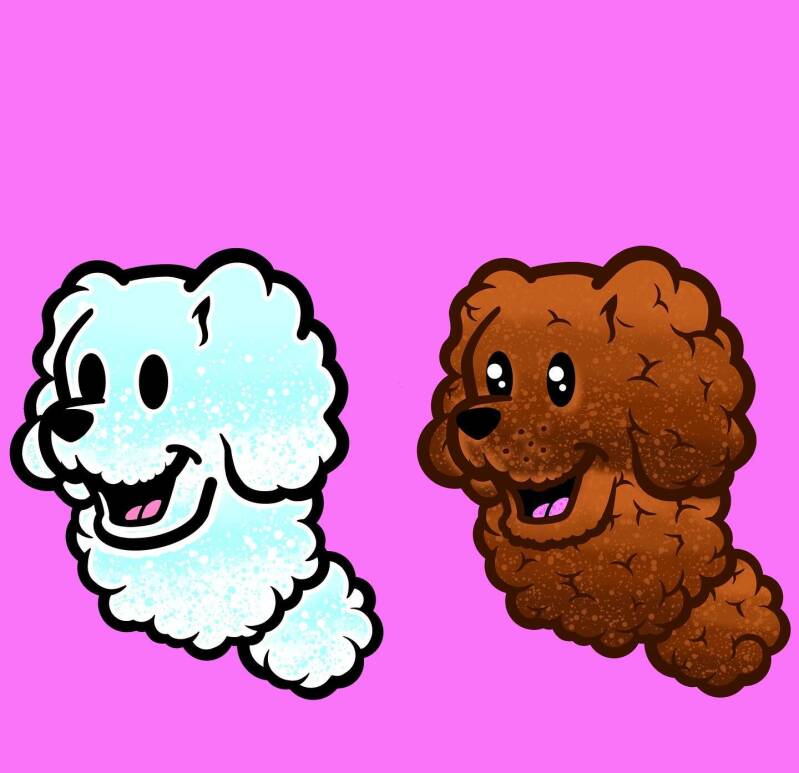
Poodle sticker design
This design was created to show my love for poodles and puppies. I wanted to create characters that were interesting to children but also stayed a bit mature to the point where adults would want to look at the design as well. This image does great with spacing, color design, line work, texture and more. For color design and spacing I chose to add blue to the white dog to show different textures of its fur. As well as keeping the picture warm and inviting, I felt if I used gray to accent throughout the picture, it would not look as inviting, it would look kind of dull. Normally gray isn't used in children based art for that exact reason it looks dull and saddening. For spacing, I kept the animals a certain distance apart so it would look like that they were not paired together but they looked like they were the same breed of dogs.

Rick and Morty vending machine poster
This image does a great job with product placement, spacing, attention to color detail, typography and shapes. This busy design was created for the Rick and Morty poster to promote a vending machine. This was designed to show how Rick and Morty is chaotic and a bit messy, but the show does a great job with grasping the viewer's attention and having multiple things to look at. When looking at this picture it is far from boring, It has elements of design that looks like the picture is moving, the main characters in the foreground and looks like you are almost watching the show. There are different shapes and colors that contrast and also compliment each other to show elements of diversity and curiosity. This flyer was designed to be busy on purpose as well as to give compliments to previous artists who created at the show

Dancing for Jesus Pamphlet sample page
This design was created for my church for a Christmas event. This flyer design was supposed to be made family friendly and follow specific guidelines for religious purposes. This design follows design elements such as color, spacing, contrast, repetition. For color, I used the classic red white and green for the Christmas theme. Black was used for the silhouette for the children and the white was used for contrast to show the depth of the design. I chose to use repetition for this design on the bows and the Christmas tree ornaments to show a sense of symmetry and balance. When working on religious based design. You want to make sure that you have things that are less chaotic as possible to show how religion is doing well in life . Though, if you use a symmetry, I think that it should be done in moderation. Just how I did the red bubbles in the background, a little goes a long way. There is a contrast and design in the background because the green grass is behind the red bubbles to show how the picture is filling up with “the blood” of Jesus. The grass is in the far background and the red is in front of it.

Knitting Through the Week Social Media Banner
To begin, the pink flier piece shows form, lines, monochromacy, use of negative space, proportion, and hierarchy. The color combination is subtle by only using black and white to signify values. This piece shows a woman in the foreground to show dominance and preference. As well as showing what the background of her room, or ambiance. This flier does a good job with showing how to create a monochromatic piece can still be eye catching. The main color is pink and the entire background shows that in different shades, as well as blue and white accent colors that helps make the whole piece pop! The use of negative space is seen on the wall behind the woman, it is apparent and needed to show that the piece is not too busy and is needed to keep the piece balanced. Lastly, proportions are best shown here when looking at the text, all of the text is small and out of that, until you look at the very top. This is where you will find the woman's name and main reason for this flier. The woman is bigger than everything else to also show everything is all about her, without having to say it.

Skilled Skulls Logo Design
To begin, the skull piece shows form, lines, symmetry, use of negative space, proportion, emphasis, and color. The color combination is subtle by only using black and white to signify values. This piece not only shows a skull, it also shows a brain to symbolize “skilled skulls”, which is the name of the piece. Based off of my peer’s feedback, ”I like that you chose showing the brain instead of a skull head shape on top of the skull design. The skull smile makes space for the martini glass outline below it. (Jerkins, Ambroshia 2024)” I can see why and how the bottom piece can be mistaken for a martini glass. It is in fact a microphone stand, and the entire piece is made for a podcast, the full piece is listed below.
Create Your Own Website With Webador